There is a myth regarding the longer an email the better will be engagement. But, you cannot just blindly follow the norms. You have to consider your subscriber’s preference. Maybe, you are targeting the people who barely have time to read long emails due to their busy schedule. In that case, it is better to keep your emails short. Also, during the busiest time of the year like “end of the financial year”, or “during holidays”, your subscriber’s might not want to receive longer emails. To establish your presence within a limited time, you can send short-engaging emails. To indulge in effective email marketing, create short emails. Let your subscriber read the email with ease and lesser time.
Writing short content is not everyone’s cup of tea. You have to be to-the-point. It is your responsibility to convey your entire messages within a few words. And conveying your message with lesser words is an art.
Also, for the subscriber’s who do not like to read long can enjoy your short-engaging emails.
Sometimes you are not getting results with longer emails, so it is always better to experiment with shorter emails. This is one of the best method to do effective email marketing.
Message with Images
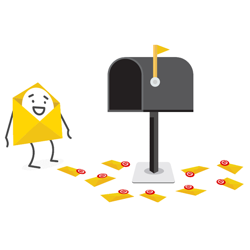
Images are in trend, and there is a reason behind that. They are simply more engaging than texts. If you are in a hurry but still open an email that contains only an image and a few texts, then you will be able to remember. And the better way is to use text in images. Infographics are images that provide information on a particular thing. So, it will do two things for you, first is to attract subscribers with visuals, and the second is to provide information in a different way. People are tired of reading texts, and especially during holiday time, they have even less time than usual. So, you better convey your motive within a few seconds while attracting them towards you. Use only those designs in infographics that are consistent with your brand design. This will help you to establish your image in the subscriber’s mind.
Try it by yourself: We have a task for you. Include one or two infographics in your emails instead of texts. And note down the results.
You will see that the click-through rate in effective email marketing campaign increases with the use of infographics/images.
Strong Call-To-Action
One of the drawbacks of shorter emails is that you cannot keep your subscriber engaged for a long time, so it is better to create a strong mental image in the subscriber’s mind with some strong words. You can use strong call-to-action at the top, below, or bottom of your email. You can also highlight the main words to make an impact.
Here is what you need to know about call-to-action buttons because using them is not a task, but optimizing them is.
Related: How to optimize your Call-To-Action Button
Size of the Button
Your CTA button should be visible to subscribers, which informs them about your expectations. Create a visible and clickable button and make sure it is mobile-friendly. Because in mobile devices, people scroll with their fingers instead of a small cursor, so create a big CTA button.
Color of the Button
Colors play a crucial role in directing your subscribers psychologically. It is observed that red color brings the most conversions, and green is the second best color for conversion. However, you have to keep in mind what your site color is. Do not use any color instead, use consistent button color. Also, do not blindly follow the trend and try to find out what works best for you. Use color contrast to get maximum clicks.
Length of the copy
Copy of the CTA button should be short and easy to read. The subscribers should be able to understand your purpose at first glance. The advisable copy length of the CTA button is less than 40 characters.
The tone of the Button
The copy on the button should be consistent with your brand. It should represent your motive, and please, never play attacking. The voice and tone of your CTA should be relevant to your target audience. It should not be robotic, instead use a unique CTA.
Descriptive CTA
A CTA should be able to translate the actual purpose. Try not to be too long or too short. These two approaches are famous in making your CTA descriptive:
Include what they will receive after clicking on your CTA button. For example, if you are offering 20% off on the product, then you can write, “Get 20% off”. It will tell them what they are about to receive.
Tell them about what you are expecting them to do. If you want them to click on a specific link, then ask them to “click here” or “click below”.
Place of the Button
It is observed that when you place a CTA at the top place, the chances of getting clicks increases as compared to the CTA at the bottom. However, do not stick to one place, try different places like at the top, between the body, or at the bottom. Use hit and trial and also, a blend of three places to get maximum results.
Create Urgency
When you create urgency like limited seats or 50% off to the first fifty customers, a need to take urgent action occurs in the subscriber’s mind. It will create Fear Of Missing Out (FOMO) and compels them to take action in a given time frame. This will make quick conversions, and accomplish your goal.
Display your products
It is always good to attach an image of your product. So, instead of describing the color and looks of the product in the email, you can simply show it with the help of an image.
When customers shop online, all they have is product images to rely on. Therefore, upload those images that provide the real sense of the product in terms of size, texture, or any other important feature.
Use Multiple Images
It is better to use multiple images rather than only one. You can display the product from various angles and any special design of the product. A study shows that more than 70% of customers like to see over 3 images to establish the genuinity of the product. Do not worry if you are not an excellent photographer, all you need is high-quality images that can be clicked by high-resolution mobile cameras. Also, images with different angles help a customer to get an overview of the product. For example, if you are displaying a woman’s dress, you can upload multiple images from the front look, back look, and length of the dress.
Upload Lifestyle Images
If you use an image with a real environment and people, customers will trust you more. For example, if you sell clothes, then you can ask customers who already bought that outfit to send an image in those for extra credit points or some attractive designs. If you sell furniture, then try uploading a picture of a furniture piece in the furniture store. This will provide a real-life experience to customers while shopping online, and chances of them staying or even buy increases.
We will launch many related articles on How you can make a success out of effective email marketing, till then keep tuned and subscribe to Mailpod for the best email marketing services, guidance, and management.